Crowning a champion in the heart of the Thoroughbred industry.
Services: Identity, Guidelines, Production
Services: Identity, Guidelines, Production
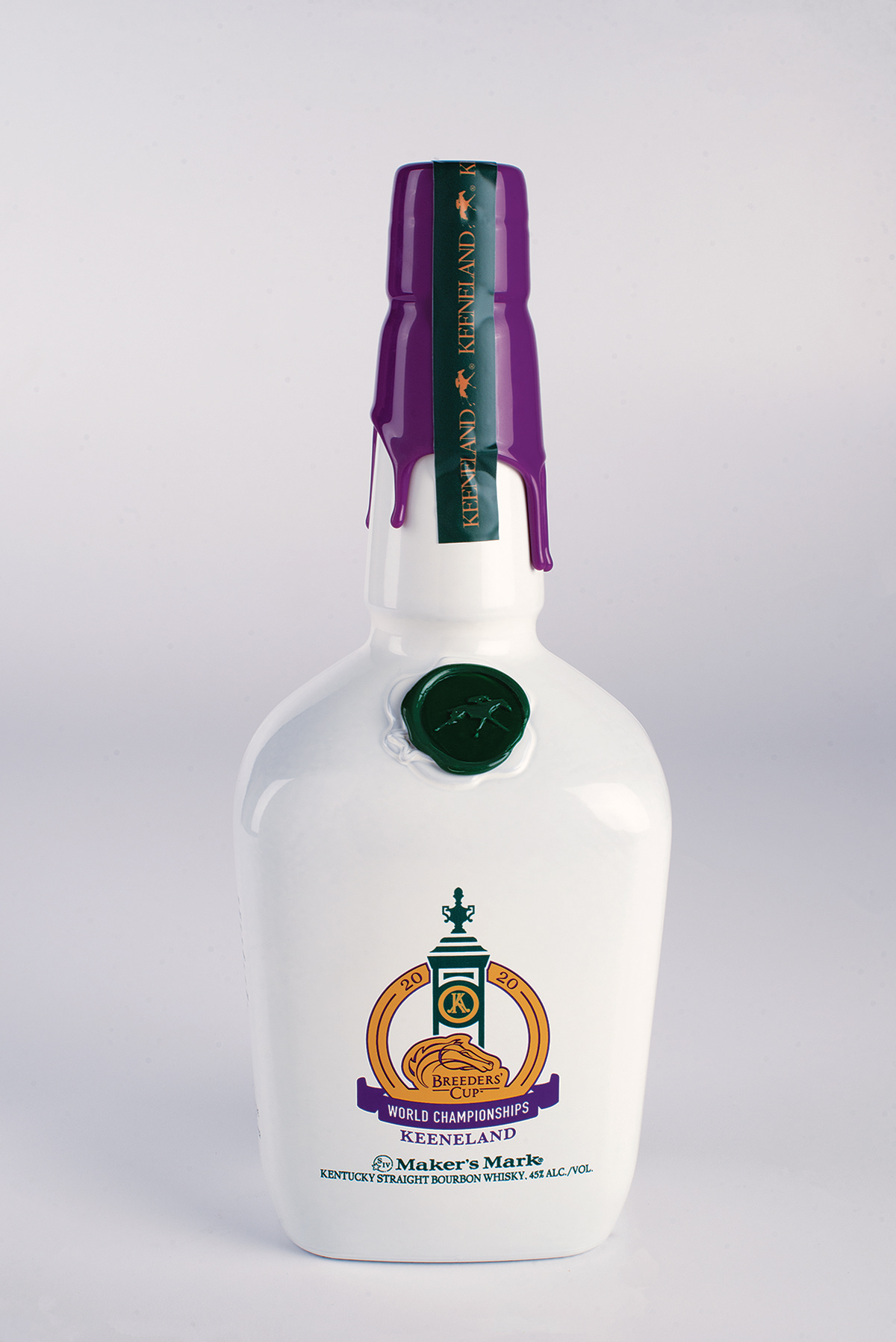
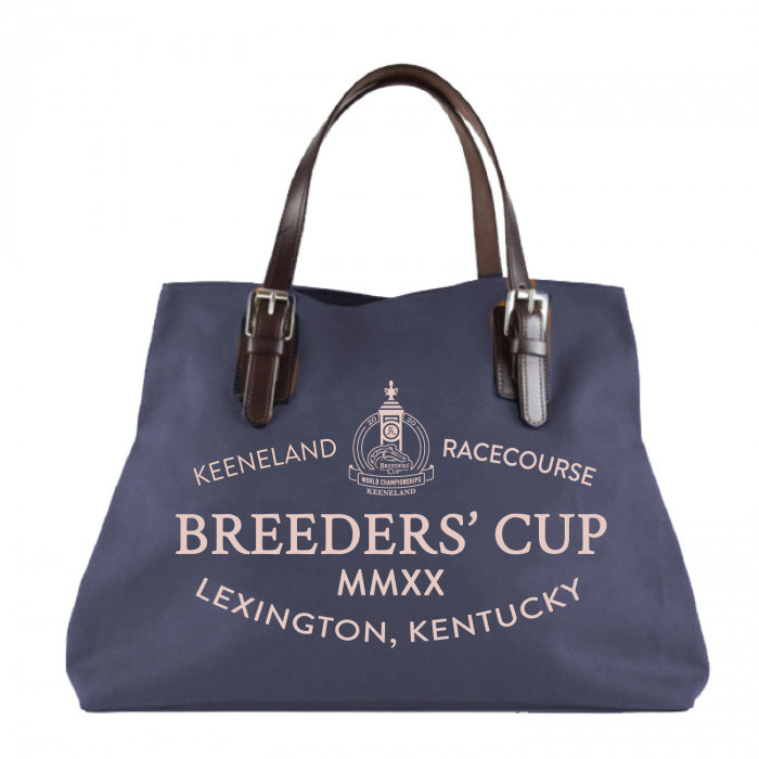
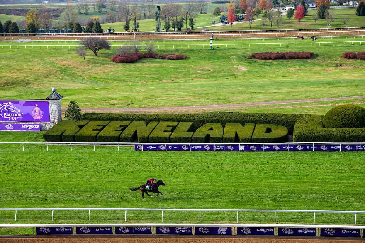
The 2020 Breeders' Cup logo brings together two iconic racing institutions: the Breeders’ Cup—the world-renowned, season-ending horse racing competition—and Keeneland, the heart of the Thoroughbred industry where many Breeders’ Cup champions were born.
Within the design, the official Breeders’ Cup logo sits below the iconic Keeneland finish line post, both of which are encircled by text presenting the prevailing nexus of the organizations: 2020 World Championships. The combination of Breeders’ Cup’s identifying colors of purple and gold with Keeneland’s deep green further denotes the meeting of the brands for the upcoming event.
All work completed at SME Branding.
Creative Director: Jason Vogel
Managing Director: Conor O'Flaherty
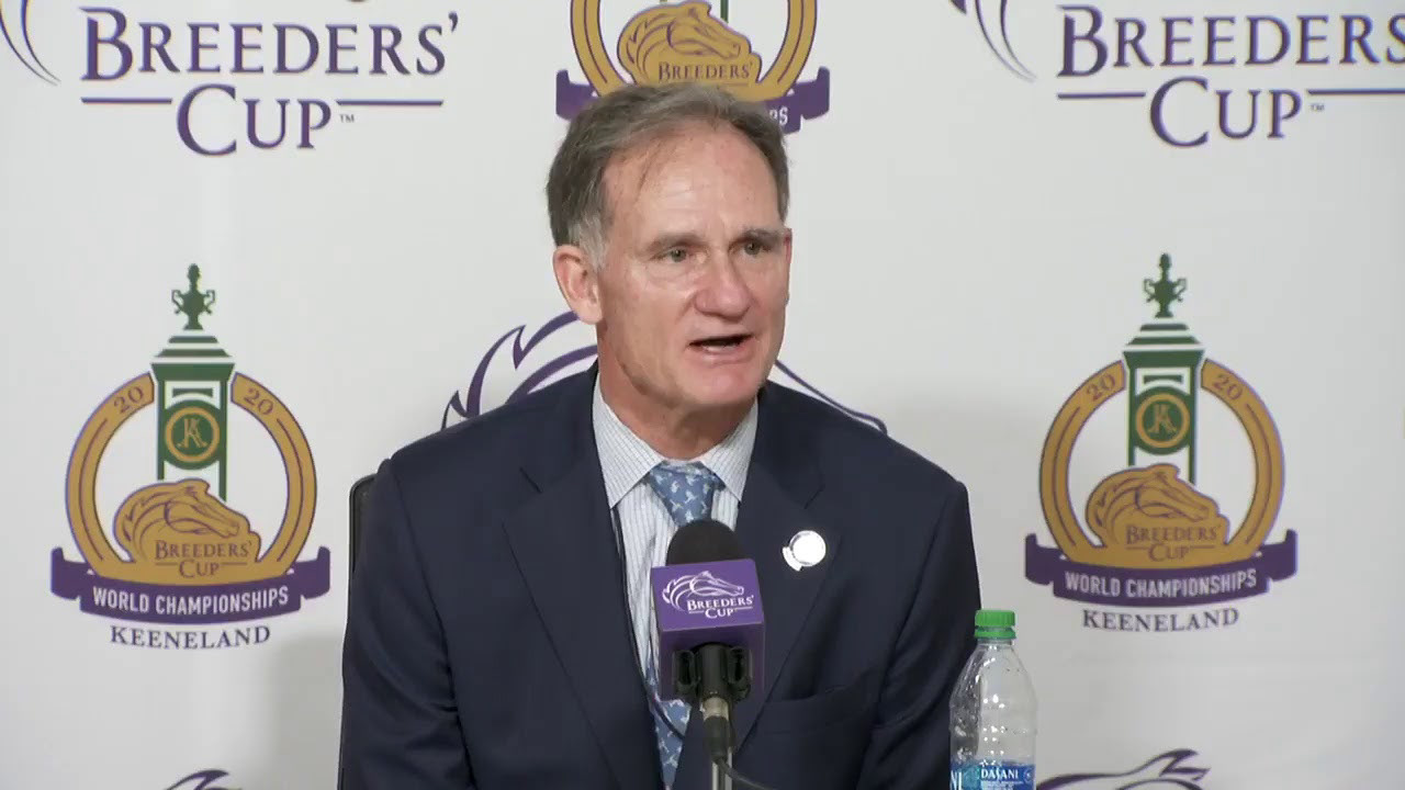
“As one of the most storied and celebrated race courses in the world, Keeneland is a fundamental fixture of Thoroughbred horse racing and the quintessential host for the 2020 World Championships. Ahead of our upcoming return to Keeneland, we’re proud to unveil our new logo which we feel perfectly unites our two brands and emphasizes that the whole truly is greater than the sum of its parts.”
— Craig Fravel, President and CEO of Breeders’ Cup
