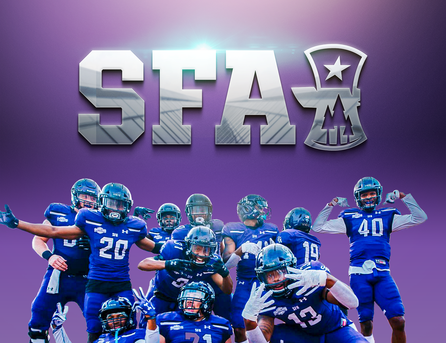
#AxeEm, Jacks!
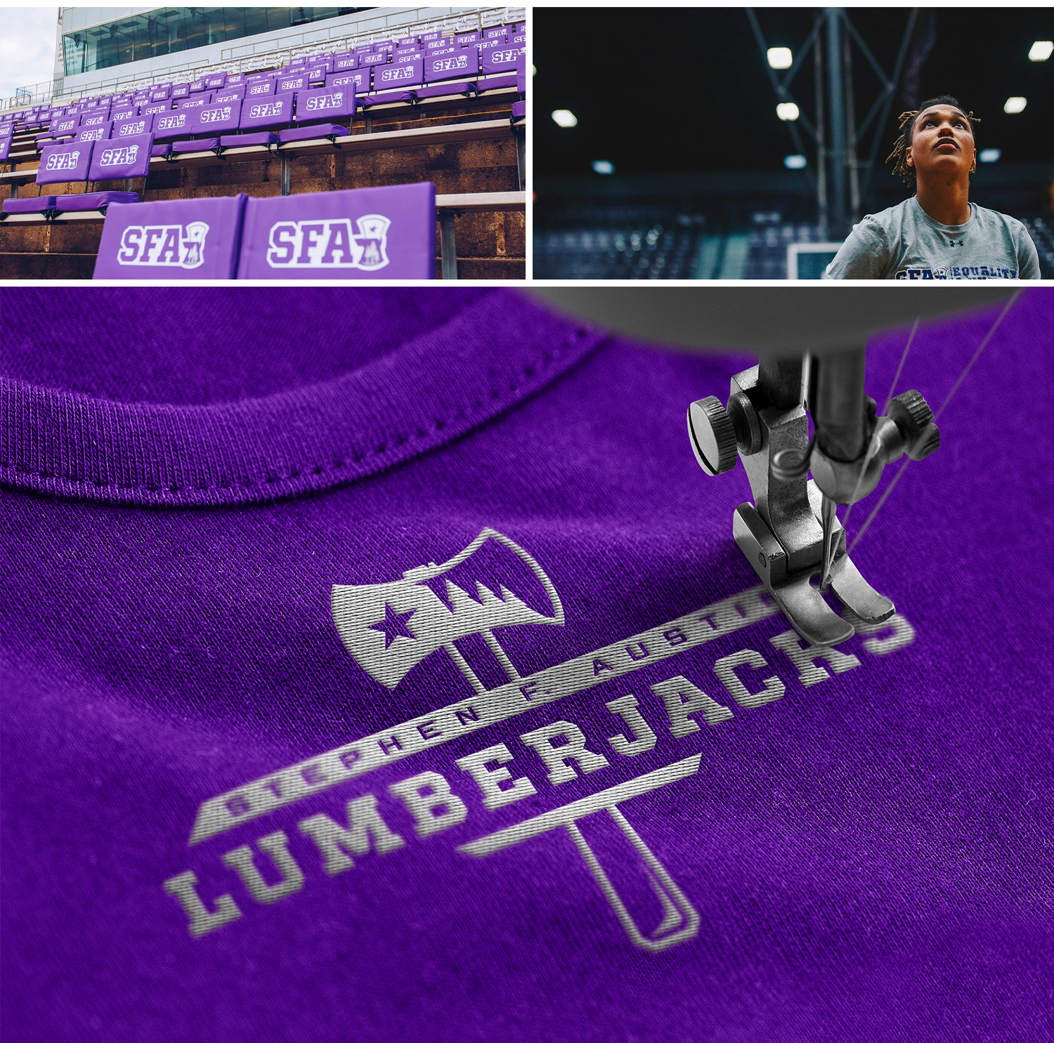
Services: BRAND Identity, BRAND Guidelines, Production
Services: BRAND Identity, BRAND Guidelines, Production
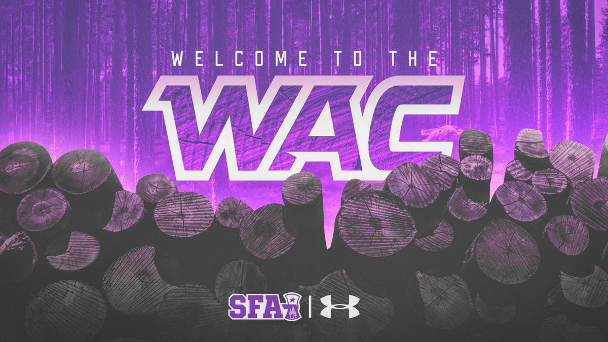
In June, 2020, Stephen F. Austin Athletics—a nearly 100-year old Division I NCAA Athletics department—unveiled a new family of athletics logos. The announcement marked the culmination of a months-long process to modernize and refresh SFA's brand identity with a consistent suite of marks.
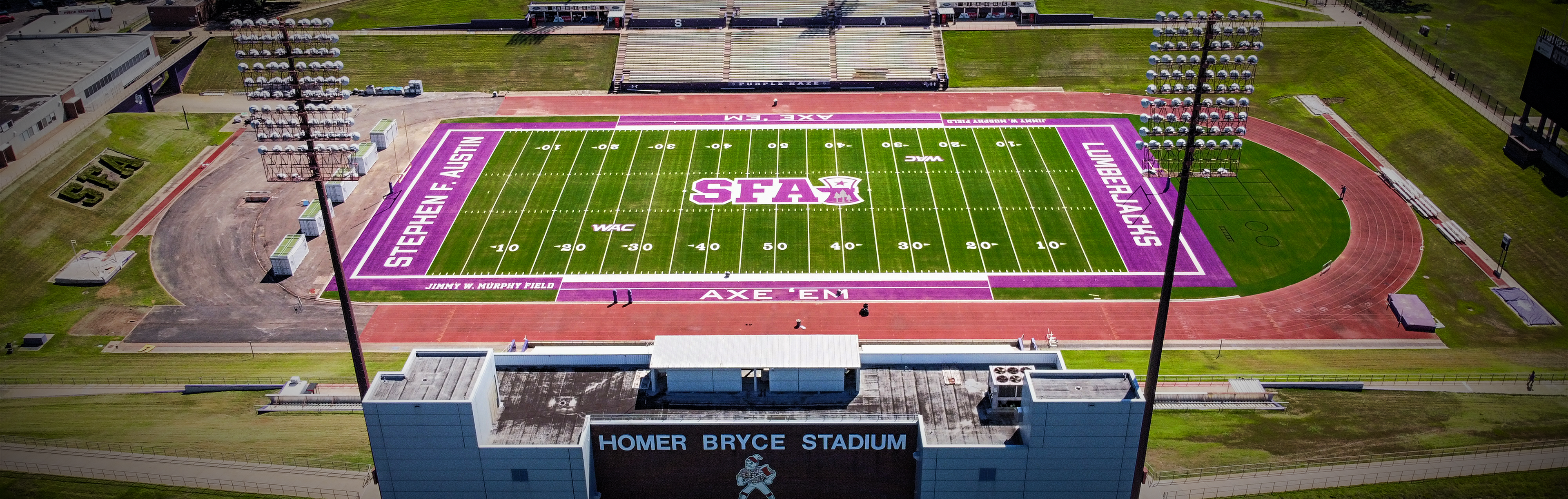
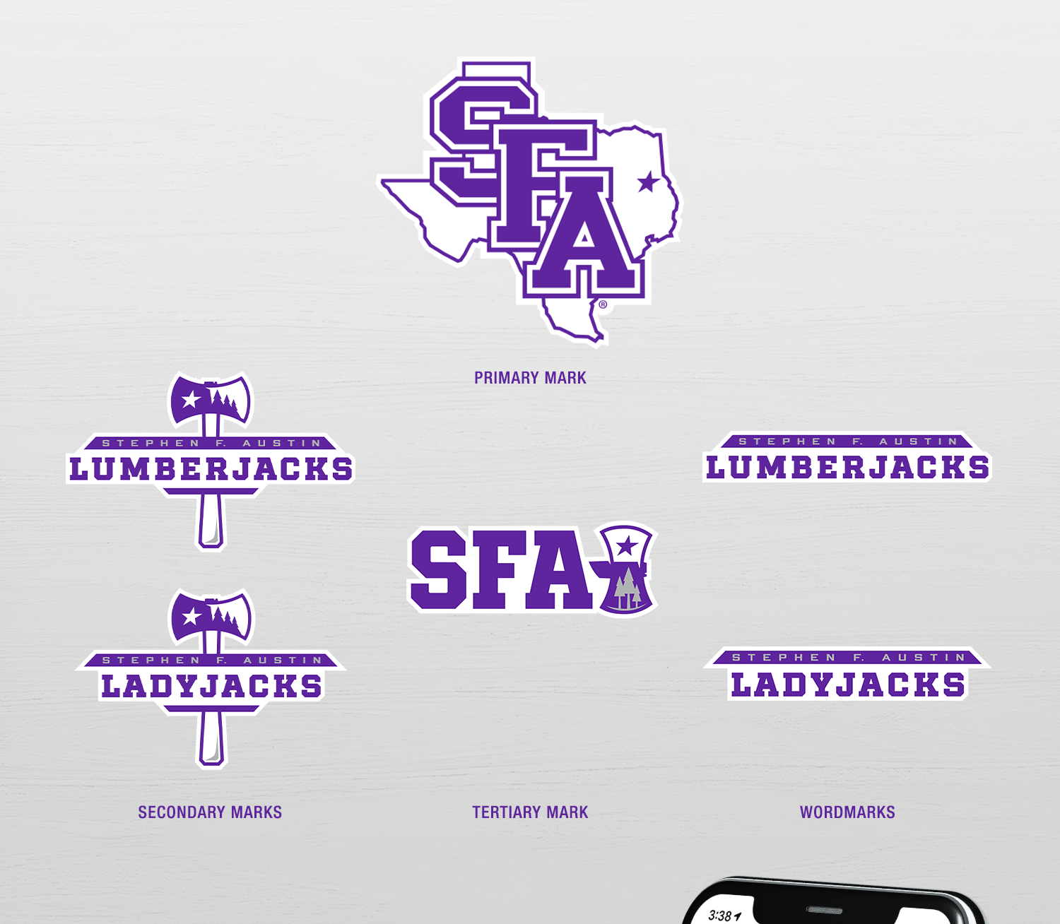
SFA's primary mark was enhanced by removing the bevel effect that had been there prior. The bold SFA lettering — diagonally placed across the state of Texas outline — remained the focal point of the mark. An italicized purple star proudly displays the location of Nacogdoches — Texas' oldest town.
Both the secondary and tertiary marks proudly pay tribute to the forestry roots of SFA's Piney Woods region, which is featured within the head of the blade in both marks. The italicized star from the primary mark follows through in both the secondary and tertiary marks, serving as a nod to Texas' status as the "Lone Star State."
All work completed at SME Branding
Creative Director: Jason Vogel
Managing Director: Conor O'Flaherty

"These marks provide us with a diverse group of assets that will allow us to expand on our iconic primary mark with consistency across all platforms. As we continue towards our vision of becoming the leading mid-major athletics department in the nation, these marks provide us with a strong foundation of our visual identity."
— Ryan Ivey, Director of Athletics


"Throughout this process, it was extremely important that we remained true to who we are. Our goal was to ensure that when any of the marks (primary, secondary, or tertiary) are visible, that you will always be able to identify it with SFA, the state of Texas and the Piney Woods of East Texas. A consistent, readily identifiable story from mark to mark was paramount during this process."
— Ryan Ivey, Director of Athletics